
Nigel Danson‘s most recent YouTube VLOG titled, A SIMPLE guide to COLOUR editing in Lightroom + HIDDEN Adobe tool! introduced the Adobe Color website, which appears to be a remake of the Kuler Adobe website and similar to the color theme extension that use to be part of Photoshop and other applications in the Adobe Creative Community, but was discontinued on July 14, 2021. Not only is his VLOG really worth viewing, but his introduction of Adobe Color triggered possibilities. In his VLOG, Nigel referenced at least one technique, which I plan to cover along with other possibilities worthy of consideration. So let’s first cover the tool itself, then break down ways landscape photographers can use the tool. For your added benefit, links to articles and VLOGs are provided to allow you to learn from the knowledge experts and provide a more immersive experience.
Adobe Color
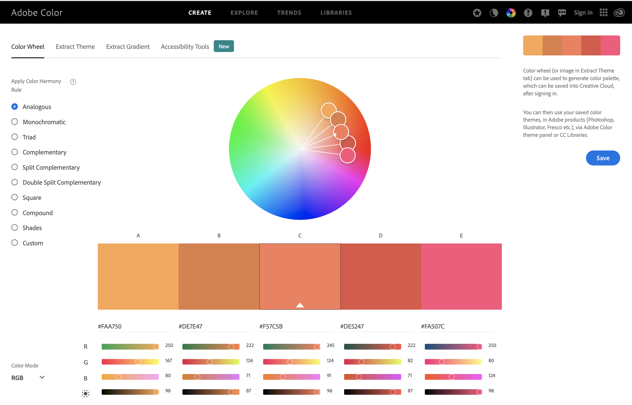
Adobe Color is a free Adobe web app and part of their Creative Community of products where you can create and review color themes found in various content, but for us, it is photographs. Essentially what Adobe is providing as a stand alone product is a Color Theory engine along with additional tools to develop color maps that are savable as Color Themes and gradient maps along with a new tool to analyze your images for view ability to support the color blind community. When you open the app it introduces users by default to the color wheel within the CREATE menu, as shown below. Here users can review the color theme off of existing imported images or create from fresh comparing the color harmony to the nine common Color Theory harmony rules found as a stacked listing with clickable radio button on the left side of the page. Clicking on these reveals theme colors rendered to support that rule. To learn a bit more on Color Theory and the harmony rules check out Adobe’s Creative Cloud posting Understanding color: a visual guide.
Before getting deep into how to use the app, let’s cover the main menu (that starts at CREATE, and provides the additional menus options of EXPLORE, TRENDS, LIBRARIES, then some icons menu options from left to right starting with Feature, Switch Theme, Color Game, Help, Forum, Feedback, Sign In, Web Apps link, and Creative Cloud link that I labeled for easy in recognizing.

Before delving into the CREATE menu components, lets briefly cover the other three main menu of EXPLORE, TRENDS, and LIBRARIES.
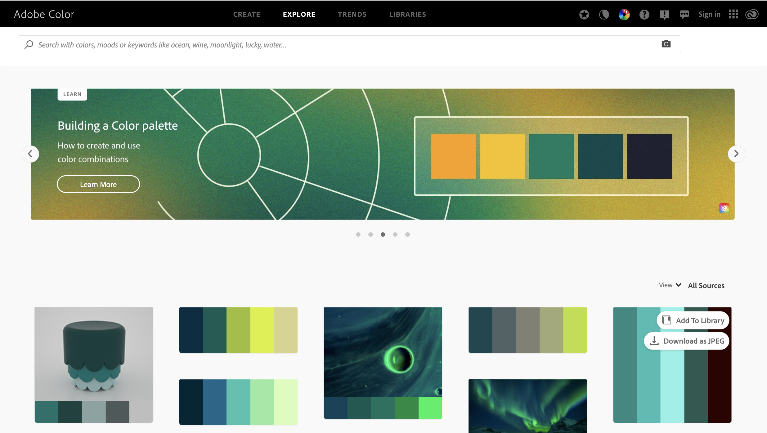
EXPLORE, as shown below, is there to allow users to explore color palettes tied to other content on file. The first time viewed offers users a learn scroller on select topics associated with this app followed by illustrations of some color palettes. The search text box above the scroller allows users to search for color palettes based upon words queued into the test box. The value with this menu feature is to trigger your thoughts on how to adopt a color palette into the creation of your planned photo shoot or how to use your Lightroom or Photoshop color adjustment tools to adjust the current color palette in that image.
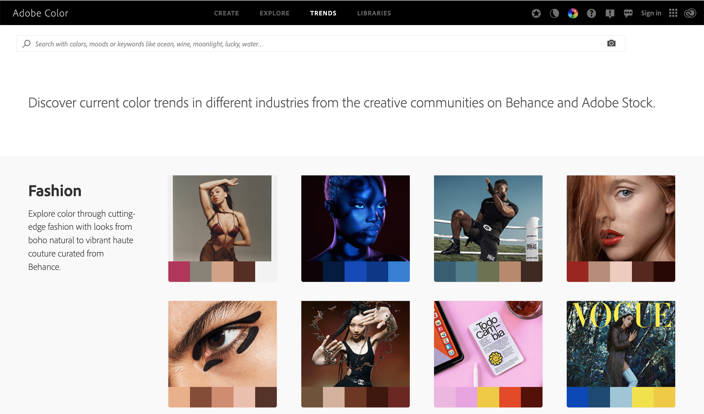
TRENDS, as shown below, allow you to discover current color trends in different industries from Behance and Adobe Stock. While not too significant a menu category of use for a landscape photographer, it could prove useful for professional photographers looking at incorporating popular color palettes for an upcoming photo assignment for one of those industries.
LIBRARIES is how you access your saved pallets. It requires you to use your Adobe account to access stored color pallets.
CREATE is the primary menu landscape photographers will want to use. The submenu defaults to COLOR WHEEL. The three other submenu items are EXTRACT THEME, EXTRACT GRADIENT, ACCESSIBILITY TOOLS. To load an image for extracting, you need to use one of the two EXTRACT submenus.
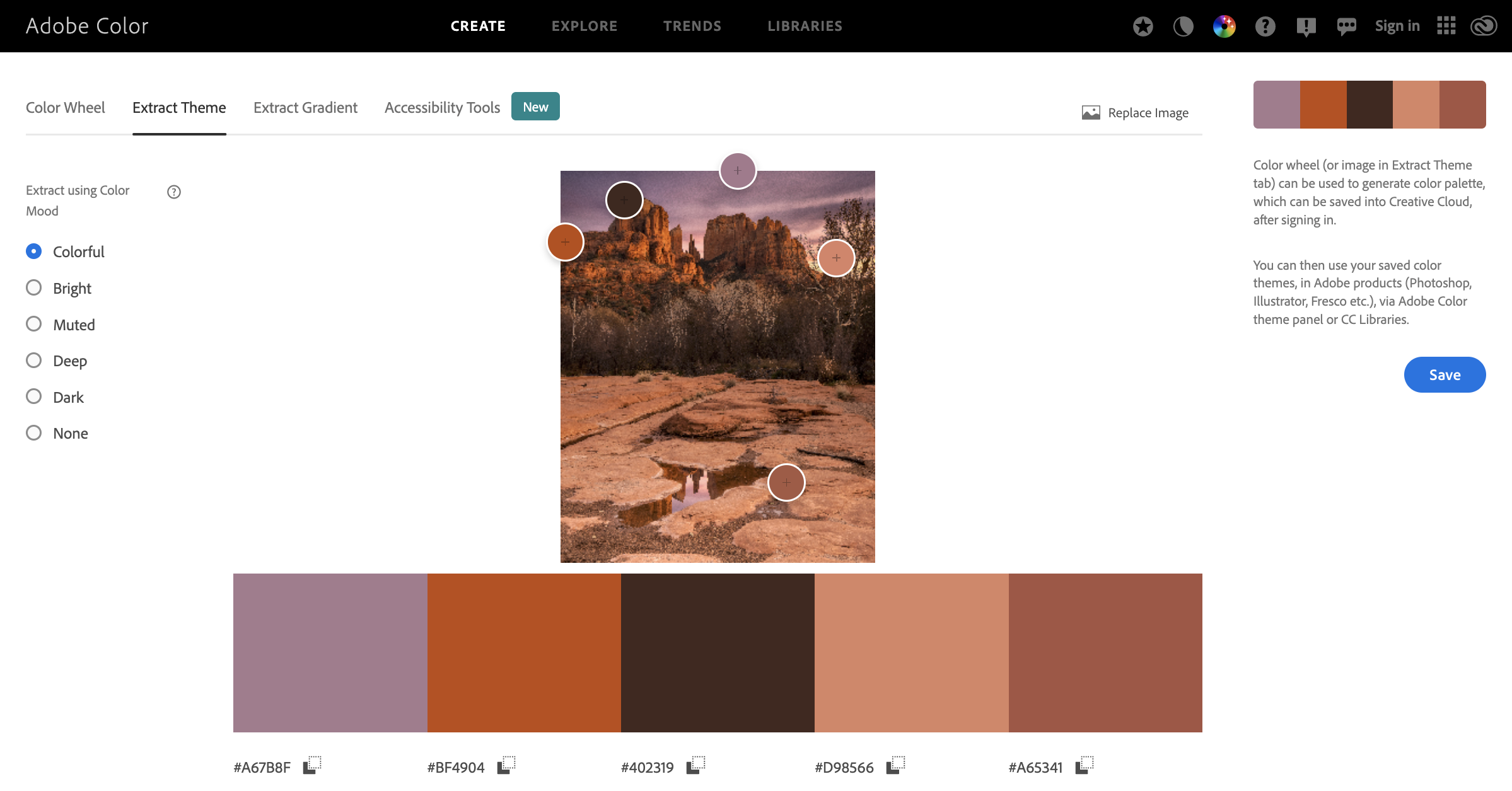
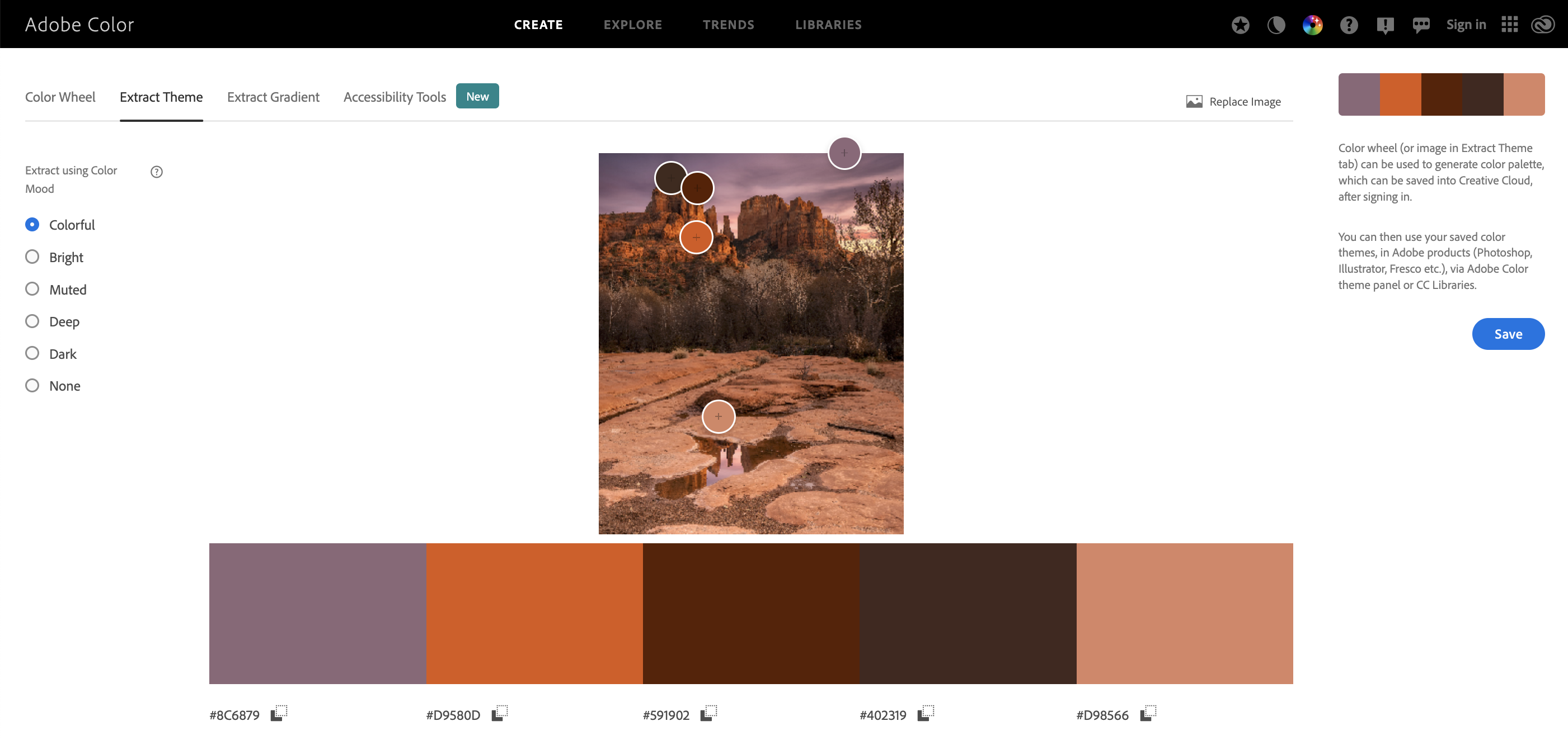
EXTRACT THEME allows image upload and extracts a five color harmony of the uploaded image. Once the color harmony is loaded, user can exam the color mode to tweak the palette between a Colorful harmony, Bright, Muted, Deep, or Dark mode. While much of this has to do with a development option that graphic designers want, it could be used in conjunction with the Color Blind Checker option within the ACCESSIBILITY TOOLS to harmonize colors suitable for a color blind viewer. The harmonized palette can be saved merely by clicking on the blue save button available on the right. Clicking on the any of the color splotches color code can copy it for transferring into other applications.
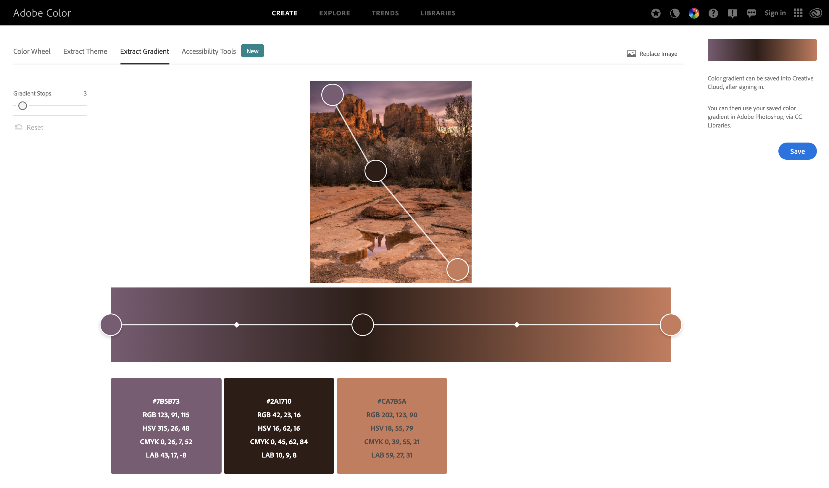
EXTRACT GRADIENT is the the most logical option of use to adjust gradient maps between images on different applications. It is similar in nature to the EXTRACT THEME submenu. By default this tool grades for at least three gradients (highlight, mid-tone, and shadows). There is a gradient scrollbar to increase the number, but for the majority of photographers, the default three gradients that identify the highlight, mid-tone, and shadows tones are what we are looking for to do our gradient matching.
There are two very useful YouTube VLOGs out there that will coach you through the process of transferring gradients colors.
The Art of Photography channel, which I encourage readers to subscribe to published the title How to copy the COLOR GRADE of ANY Image
Here Ted Forbes offers two techniques to color match gradients between two images.
While Adobe Color has been around and is a tool used mostly by graphic and web designers to develop color pallets. It can be used by landscape photographers in the following two ways:
- Match a color grade using a color balance adjustment layer
- Match a color grade using a curves adjustment layer
Both of these are excellent techniques to apply during the post processing. Recent upgrades to both Lightroom and Photoshop offer additional color correction options that will improve your color harmony. Check out How to change colors in Adobe Photoshop and Lightroom’s improvement explained in an Fstoppers article titled How to Use Lightroom’s Powerful New Point Color Tool.
My Color Theory Approach
Since learning about color theory, I have attempted to apply color theory in two approaches, as discussed below, often attempting to use both approached to offer the most consistent outcome of achieving my color harmony endeavor.
- Compositional Phase. Here you would use the smartphone app Adobe Capture either through the use of your smartphone camera or through a test jpg image passed from your camera to your smartphone. Using color theory in this phase is perhaps that best method as it will to get an image with the desired color harmony.
- Post Processing Phase. This is the easiest application process most commonly employed, but it requires a sound base on using your post processing tools and my not offer true color harmony.
When you look at my exposed posts, you now see the addition of my color theory review. I’ll let you judge the value of using color theory from those posts.