
Capturing the Core: The Story and Science Behind the Western Auto Moon Alignment
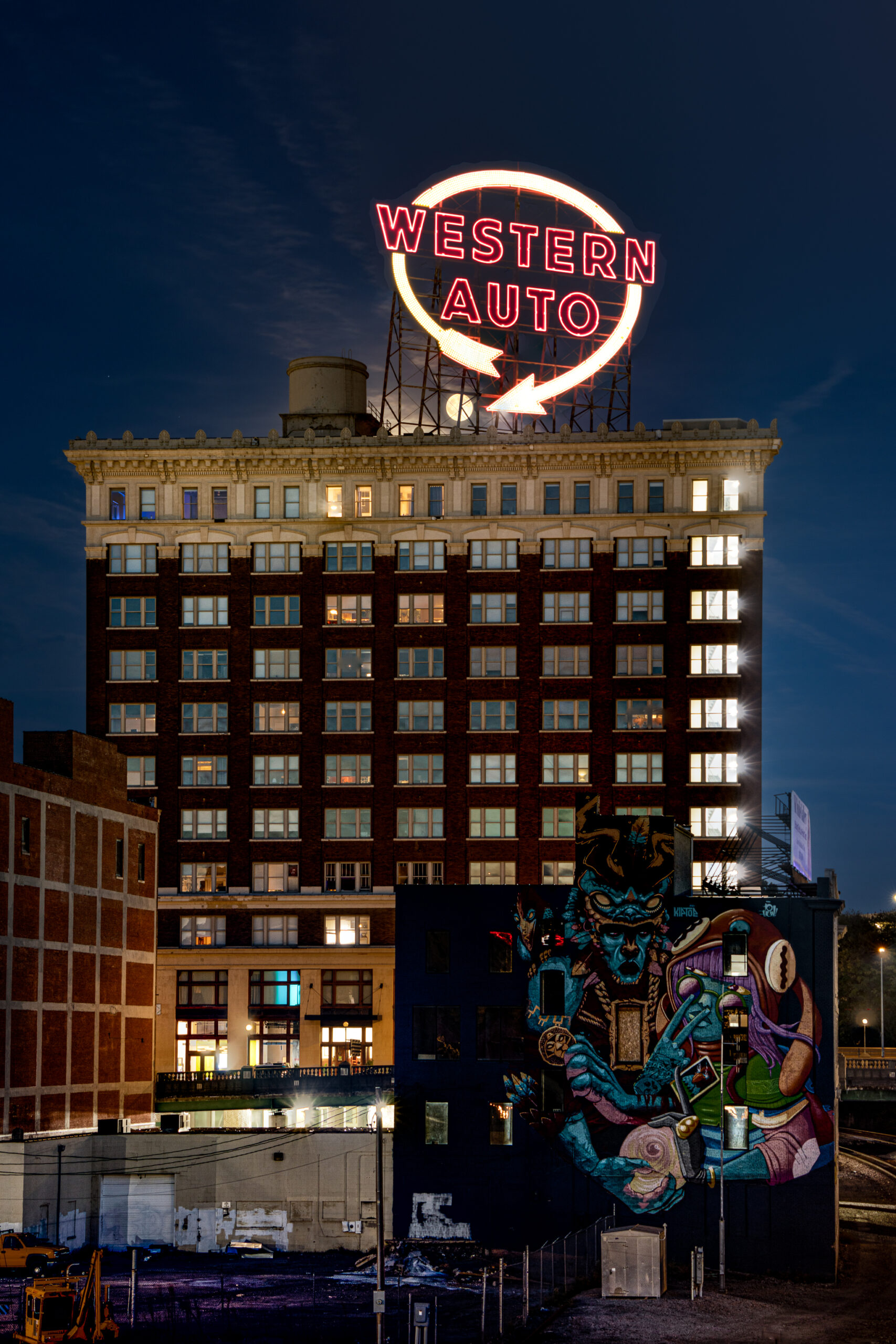
The Western Auto sign is one of the defining landmarks of the Kansas City skyline, but I wanted to photograph it in a way I had not often seen: with a detailed full moon appearing within the steel structure of the historic neon sign.
That idea sounds simple. In practice, it required much more than waiting for a full moon and arriving with a tripod. My camera position was severely restricted. The moon had to rise on the right azimuth and reach the correct altitude. The building, moon, and neon required very different exposures. The Western Auto sign followed its own lighting sequence. Even the weather had to cooperate during a very small window.
Just as importantly, I photographed the session entirely manually, controlling both the camera settings and focus myself. Planning software could tell me where the moon should be, but making the photograph still came down to decisions at the camera.
The final photograph is therefore not a single exposure. It is a carefully aligned composite of three separate captures, each made for a different part of the scene and at the moment when that element could be best recorded.
The Inspiration and the Rarity of the Alignment
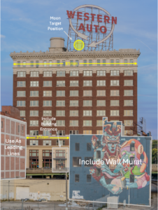
My original concept was very specific. I wanted the full moon positioned within the Western Auto sign’s steel scaffolding, just left of the arrowhead and immediately above the roofline. An annotated planning photograph identified that small area as my target.
But the moon was only one part of the composition.
I wanted the broad façade of the Western Auto building to remain prominent, with the entrance visible through the narrow opening created by the foreground buildings. I also wanted to retain the mural on the back of 2134 Grand Boulevard and the structure on the left as compositional elements leading the eye toward the Western Auto building.
Those requirements effectively determined where I had to stand.
A tall chain-link fence below the overpass eliminated the lower shooting positions because I could not photograph over it. Moving elsewhere would alter the relationship among the entrance, mural, foreground buildings, and sign. That left me on the east side of the Main Street overpass, looking through a narrow opening between 2100 and 2134 Grand Boulevard.
There was no practical way to chase the moon by moving the tripod.
The moon had to come to the composition.
Reading the Shooting Map
That geographic constraint is why the satellite shooting map matters.
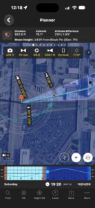
The blue camera icon identifies my shooting position, while the red marker identifies the rooftop location of the Western Auto sign. Read together with the annotated photograph, the two illustrations explain different parts of the same problem: where I physically had to stand and where the moon needed to appear within the resulting composition.
The surrounding streets, rail corridor, buildings, and overpasses visible in the satellite view also put the location into context. This was not an open landscape where I could walk several hundred feet in either direction to correct an alignment. I was working with a restricted urban sightline.
That made predicting the moon’s position in advance essential.
|
Picture Info
|
|---|
 October 25, 2026 |
 6:12 PM CDT |
|
EXIF
|
|---|
 Sony ILCE-7RM5 |
 Tamron 50-400mm Di III |
 70 mm |
 f/8 |
 200 |
 6 sec |
 No Flash |
Turning the Idea Into Geometry
I used PhotoPills to investigate when the moon’s path would cross my target.
The Planner turned my idea into measurable geometry. In the planning screenshot, PhotoPills shows a camera-to-target distance of 682.6 feet, an azimuth of 78.1°, and an altitude difference of 23 feet, or 1.93°. Most importantly, the Planner plots the moon’s changing path rather than merely showing a general moonrise direction.
I did not simply need a full moon somewhere behind the Western Auto building. I needed it to cross a small area of the rooftop sign while I remained at a predetermined camera position.
The information across the Planner screen also displays a Sony a7R V, 70 mm focal length, f/8, portrait orientation, and other planning information. Those values helped visualize the proposed composition, but they should not be interpreted as complete exposure metadata for the finished composite.
The PhotoPills Augmented Reality view gave me another way to test the idea before committing to the shoot.
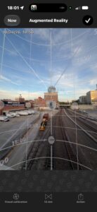
Instead of looking down on a satellite map, AR placed the predicted lunar path over the actual view toward the Western Auto building. In the displayed planning view for October 24, 2026, the projected path placed the moon in the vicinity of the rooftop sign.
That was an important bridge between calculation and composition.
The Planner answered one question:
Does the geometry work?
The AR view answered another:
What will that geometry look like from where I am actually standing?
Neither was a guarantee. Clouds could still hide the moon, and the neon could be somewhere else in its lighting sequence. But together they gave me confidence that the alignment was worth pursuing.
Weather: The Variable I Couldn’t Plan Away
Once the geometry worked, weather became the remaining uncertainty.
I used Clear Outside, Windy, and The Weather Channel to assess conditions, with Gemini helping me interpret what I was seeing. High-cloud cover was around 20 percent. What mattered was not simply whether clouds existed, but whether they would obscure the moon during the brief alignment window.
The clouds cleared sufficiently for the shot, leaving only a faint trace highlighted by moonlight in the finished photograph.
Planning had put me where I needed to be.
From that point forward, the photograph depended upon what happened in front of the camera.
Photographing Everything Manually
One part of the process deserves emphasis because it affected everything that followed: I photographed the entire session with both exposure and focus under manual control.
I did not want changing ambient light, bright neon, individual illuminated windows, or the moon itself causing the camera to make exposure decisions for me. Likewise, I wanted direct control over focus for the individual frames that would eventually need to align.
That consistency became particularly important once I realized that a single exposure could not produce the photograph I had envisioned.
My Sony a7R V’s stated 15-stop dynamic range did not solve the fundamental problem because this wasn’t simply a question of dynamic range. Different parts of the scene required different shutter speeds, and some of the conditions I needed occurred at different moments.
The moon required a short exposure.
The building required a much longer exposure just after blue hour.
And the Western Auto sign had to be photographed at the correct point in its automated lighting sequence.
Those conditions did not coincide.
What the Exposure Numbers Do, and Don’t, Tell Us
It can be tempting to look at those three exposures and use their differences to describe the dynamic range of the scene. I initially did something similar, with Gemini helping me estimate a 12.5-stop span.
On closer examination, the exposure settings by themselves don’t support that conclusion.
At the common aperture of f/8, the six-second and 1/125-second shutter speeds differ by approximately 9.55 stops in shutter duration. Once the moon frame’s higher ISO is considered, the exposure-setting difference is approximately 8.55 stops.
But neither calculation establishes the actual dynamic range of a scene photographed at different moments.
More importantly, neither calculation addresses the fundamental photographic problem.
I did not make three source exposures simply because the camera couldn’t hold enough brightness range.
I made three exposures because brightness, movement, timing, and the changing illumination of the Western Auto sign required different captures.
That is a much more accurate description of what happened in the field.
Where Moonlight Meets Neon: Building the Final Image
The finished photograph brings those separate moments together: a sharply recorded moon within the sign structure, the fully illuminated Western Auto neon, architectural detail throughout the building, visible interior lighting, and the foreground mural anchoring the lower portion of the composition.
The blend is not intended to suggest that every element was recorded this way simultaneously.
In fact, by the time I photographed the fully illuminated neon, the moon had moved to the left of the position I wanted. The sign exposure therefore contained a moon I did not want duplicated in the final photograph.
I used Photoshop’s generative removal feature to remove that moon from the sign exposure. After aligning the source photographs, I used layer masks to combine the moon from its short exposure, the complete neon from the sign exposure, and the building and foreground from the six-second exposure.
That distinction matters to me.
This is a composite of separately timed captures designed to realize a composition I planned in advance. It is not presented as a documentary claim that all three conditions existed simultaneously.
Finishing the Photograph
After assembling the composite, I returned to Lightroom for localized refinements within my HDR and 32-bit workflow.
Separate masks allowed me to work on the building lighting, moon exposure, and neon details individually rather than applying the same correction everywhere. I also used a linear gradient on the sky.
My purpose wasn’t to make every part of the image equally bright. It was to make the separately captured elements read coherently while preserving the appearance of an evening photograph.
The moon and Western Auto sign needed to remain the visual destination.
The illuminated windows needed to make the building look occupied.
The entrance, foreground structures, and mural needed to support those elements without competing with them.
What the Histogram Actually Tells Me
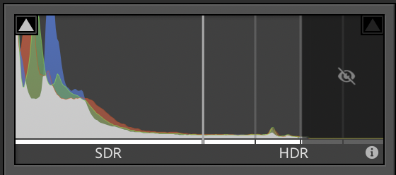 The Lightroom histogram provides one way of examining the tonal character of the finished image.
Because much of the photograph consists of dark sky and shadowed surroundings, a concentration of tones toward the left of the histogram is appropriate to the scene. It does not, by itself, mean that the photograph is underexposed.
Smaller areas occupied by the moon, streetlights, illuminated windows, and neon contribute much brighter values toward the right.
In Lightroom’s HDR editing mode, the histogram can extend beyond the standard dynamic range white level to represent brighter HDR values. A value entering that region should therefore not automatically be interpreted as a clipped highlight.
The objective was never to produce a neatly centered histogram.
It was to preserve the character of night while retaining lunar surface detail, neon color and structure, and useful architectural information.
The red, green, and blue traces in the histogram likewise indicate the distribution of channel intensities. They do not directly measure saturation, nor can the final histogram by itself establish the dynamic range of the original scene.
That distinction became even more interesting when I started looking at the photograph’s color.
Reading the Color: More Than a Palette
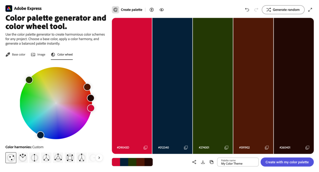
Color was not the original problem I set out to solve. My attention in the field was concentrated on geometry, timing, focus, exposure, and the changing neon.
But examining the completed photograph afterward revealed another part of the image that I found fascinating.
Adobe Express extracted five representative colors from the photograph:
#D9043D#012340#274001#591902#260401
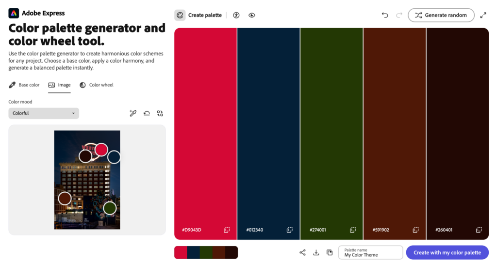 The five-color extraction gives me a useful simplified palette. The deep blue speaks to the evening environment, while the reds, greens, and dark earth tones connect to the neon, architecture, and mural.
But I wanted to look more deeply at how those colors were actually distributed.
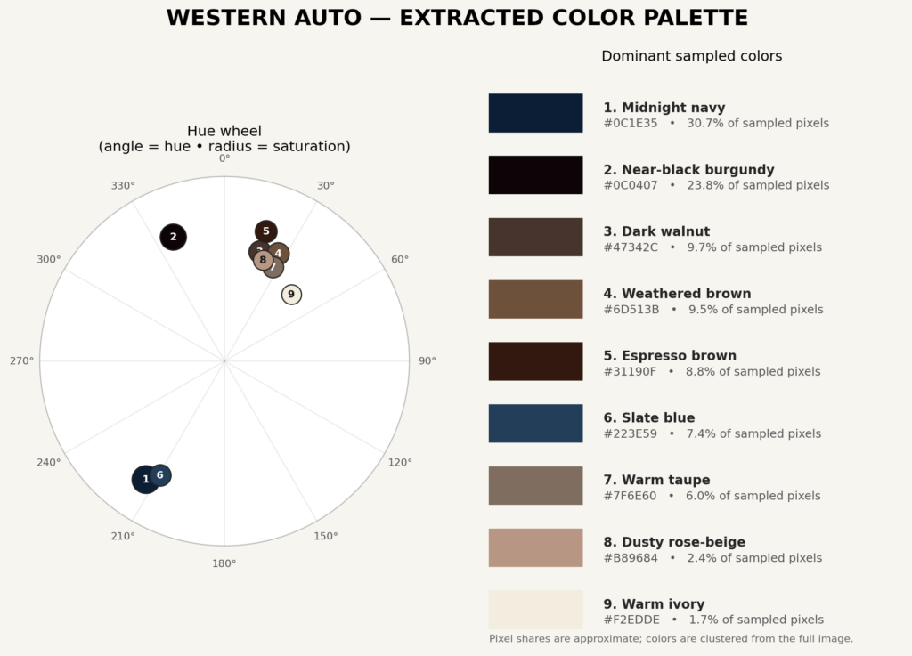
A separate analysis grouped the photograph into nine representative sampled colors:
These percentages should be understood as approximate sampled pixel shares, not an absolute scientific measurement of every color present in the photograph. They are clustered representations of a picture containing far more colors than nine swatches could possibly describe. The source analysis itself characterizes the distribution as approximate. [color theory analsys | Word]
What I find valuable is not the exact percentage assigned to an individual swatch. It is the larger pattern the extraction reveals.
The photograph is dominated by a relatively restrained foundation of deep blues, near-black burgundy, dark browns, and muted architectural tones. Much smaller portions of the frame contain the light and warmer values.
That observation connects surprisingly well with the histogram.
Darkness isn’t simply empty space in this photograph. It is part of both its tonal and color structure.
A Layered Color Relationship
The more detailed color analysis suggested that the photograph cannot be neatly described by a single textbook color harmony. Instead, it contains overlapping relationships: analogous color harmony, warm-cool contrast, complementary and near-complementary accents, and a low-key tonal structure. [color theory analsys | Word]
That description makes sense to me when I look back at the completed image.
The deep blues establish much of the cool nighttime environment. Dark neighboring hues and earth tones form a subdued foundation. The warmer illumination is then allowed to stand apart from it.
The blue/orange relationship introduces complementary contrast, while blue-green and red-orange provide near-complementary relationships. [color theory analsys | Word]
That helps explain why the Western Auto neon has so much visual power despite occupying a relatively small percentage of the photograph.
The sign does not have to compete with equally intense color throughout the rest of the frame.
Instead, the surrounding darkness gives it somewhere to shine.
Five Colors or Nine?
The five-color Adobe Express analysis and the nine-color extraction do not need to agree exactly, because they are different ways of reducing a complex photograph into something we can examine.
That is actually why I find it useful to show both.
The five-color Adobe Express palette provides a compact summary of some of the prominent colors in the finished photograph.
The nine-color analysis and hue wheel go further by showing a more nuanced sampling of the blues, burgundies, browns, neutral architectural tones, and lighter values, along with their approximate distribution and positions around the hue wheel.
I don’t see these as competing interpretations.
I see them as two different levels of abstraction.
One simplifies the photograph so its principal color relationships are easy to see. The other reveals more of the variation hidden inside that simplification.
Perhaps the most useful insight to come from this analysis is that the photograph relies more on color hierarchy than color variety. [color theory analsys | Word]
It doesn’t require large areas of vivid color.
A substantial dark foundation allows comparatively small areas of illumination and warmer color to attract a disproportionate amount of attention. The Western Auto neon becomes one of those accents. The illuminated windows provide another. The moon introduces a much lighter focal element, while the mural adds localized color without replacing the sign as the principal destination.
Put much more simply:
Most of the photograph stays quiet so that a few important colors can speak loudly.
For me, that is more useful than trying to force the photograph into one color-theory formula.
The analysis helped me recognize, after making the image, how the balance between dark and light, cool and warm, restrained and vivid color contributes to the path the eye follows through the finished photograph.
What I Would Change Next Time
Not everything in the finished photograph worked exactly as I would like.
The brightest windows on the right side of the Western Auto building are the most obvious example. Their glow and starburst-like streaks were present, although less prominent, in the original f/8 building exposure and became more noticeable during processing.
Balancing architectural detail and naturally illuminated interiors against those intense highlights is a problem I did not completely resolve.
This was also my first shoot with the Tamron 50–400mm F/4.5–6.3 Di III VC VXD, so the photograph gives me a useful reference for understanding how my capture and processing decisions affected the rendering of bright lights.
The royal-light-blue window near the upper-left portion of the building is another small detail I would refine. A targeted local adjustment could reduce its visual pull without eliminating the interior light that helps the building appear occupied.
I don’t see those things as reasons to hide the photograph’s imperfections.
They are part of what the shoot taught me.
Bringing the Vision Into Focus
What began as a simple idea, putting a full moon into a small opening within the Western Auto sign, became an exercise in several different kinds of precision.
The city determined where I could stand.
The moon’s path determined when I needed to be there.
PhotoPills helped me determine whether those two constraints could intersect.
The weather determined whether I could actually see the moon.
The Western Auto sign determined when I could photograph the complete neon sequence.
And manual exposure and manual focus let me decide how each individual source image would be recorded.
The resulting photograph did not happen during one perfect fraction of a second.
The composition happened because I imagined that fraction of a second and then discovered that realizing it required several carefully chosen moments.
The moon was captured sharply at 1/125 second. The neon was captured when the sign reached the illumination I needed. The architecture was recorded over six seconds as the building settled into its evening appearance.
Each exposure solved a different problem.
Blending those exposures allowed the solutions to become one photograph.
Then, analyzing the finished photograph taught me something I had not necessarily set out to investigate. The histogram showed how much of the image’s identity depends upon darkness. The color extractions showed that the same principle extends into its palette. Large areas of restrained blues, near-blacks, and earth tones provide a foundation for the comparatively small areas of warm illumination, neon, and moonlight that catch the eye.
For me, that is ultimately what this photograph records.
It is the meeting of moonlight, neon, architecture, planning, patience, and post-processing, but it is also a record of everything I learned along the way. The bright windows and distracting blue interior light remind me that achieving an alignment and refining an image are related, but very different, challenges.
The core of the photograph isn’t simply a full moon beside a familiar Kansas City landmark. It is the connection between a photograph imagined long before the shutter was released and the deliberate work required to bring that photograph into focus.